When you’re traveling, there are inevitably some days when you wish you could just teleport back to the comforts of home. Today is one of those days. There’s nothing in particular that sets off a day like this for me; it’s always a combination of things, little annoyances that grow into a festering pile of the blarghs. Among those today are:
- the inability to top off my pre-paid cell phone (our bank won’t communicate with Airtel India, despite many attempts and conversations about where we are and why they need to)
- the difficulty of hand-washing and drying everything, from dishes to laundry—and learning new systems to do so
- the little foibles of cooking and eating in a foreign country
- the length of time everything takes. For reference, think how long something should take, and double it, then double it again for good measure.
Yeah, that about covers it. Any one thing on its own and I’m fine, but today, for whatever reason, both Brian and I are in the full-on grumps. What do you do when you’re in the grumps? I distract myself; hence, the blog writing…
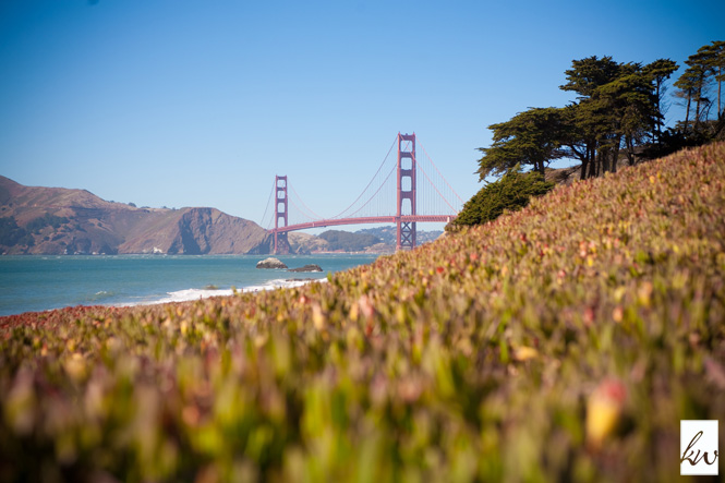
Thinking of the comforts of home reminded me that I haven’t posted about my fifth watercolor painting, a view of the Golden Gate Bridge from Baker Beach. Baker is one of my area favorites for its sheer beauty. Here’s the inspiration photo:
And here’s the final painting: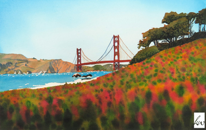
I thought I’d take this opportunity to share the process for building a painting like this one, step by step (you can also skip ahead to the end to watch an animation of the whole process):
- Step one is to trace the major elements of an image onto my watercolor paper.
- I began by adding some thalo blue in the upper corners, painting wet on wet.
- Next I did two more washes of blue until I was happy with the color. When watercolors are wet, they’re darker, so you have to wait until the painting is dry to see what you think. Also, to avoid blossoms—aka screw-ups, which you’ll see later—you often have to wait for the painting to dry between washes.
- Then I added masking fluid in the water to preserve highlights.
- Using a richer mix of thalo blue, I painted in the ocean wet on dry because it’s a small space and easy to blend together.
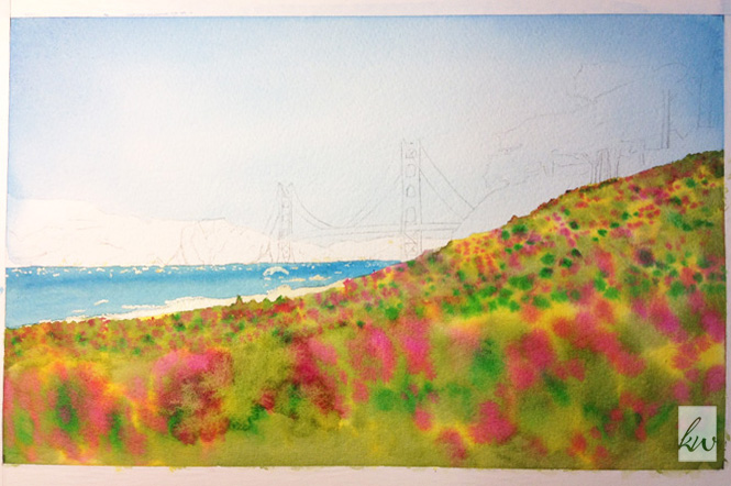
- Next I moved to the foreground ice plants, a large space that had to be completed wet on wet to avoid hard edges. As you can see in the inspiration, there are basically two swaths of ice plants—those in the foreground that are large and completely soft-focused, and those in the middle that are smaller and a bit sharper. Thus I painted the plants in two rounds, starting with the small, sharper plants. IIRC, the colors used here are transparent yellow, hooker’s green, olive green, and permanent rose.
- This next step was one of the hardest because it involved methodically covering one-third of the painting with the four colors above, while ensuring that nothing dried too quickly. As you can see from the pic below, I blew it. There’s a big blossom left of center, which happens when you add more paint/water to an area that’s dried.
- But, with all things you have to move on, so the next step was to start shading the background mountains with more thalo blue (love that color!) and, after that dried, burnt sienna.
- In an attempt to repair my foreground, I added in some darker tones, then
- Kept moving with some burnt sienna on the hills and trees, and permanent rose on the bridge.
- Next came darkening the hillside and bridge shadows with French ultramarine blue, then adding some depth there and in the trees using olive green.
- My instructor, Guy, decided I needed some help with those pesky ice plants, so he added in some darks in the foreground. (I am totally still a beginner and need help!)

- After Guy worked on the foreground, I used some more of the dark (a mixture of perm rose, hooker’s green, and thalo blue) to add depth in the shadows—trees, rocks, and hillside.
- Then the bridge needed some work. I tried several colors to find one that I liked, and finally settled on burnt sienna over permanent rose.
- Guy helped me one more time with the fine details of the bridge, particularly the suspension cables…and we were about to declare the painting finished when I decided the foreground was drawing too much attention.
- Last step: A unifying wash of burnt sienna on the foreground to tone it down and bring it more in line with the other colors in the painting.
You can watch the progression of everything done in the animation below:
Hope this was entertaining. Any questions about the painting process? Let me know in the comments below.
Cheers,